A Collection of Voyages and Travels Volume 6
View FullscreenThis exhibit on A Collection of Voyages and Travels Volume 6 features 13 chapters of exploration by land and sea across the globe. Using fullscreen with this Neatline exhibit is reccomended.
Exhibit by Tim Malueg
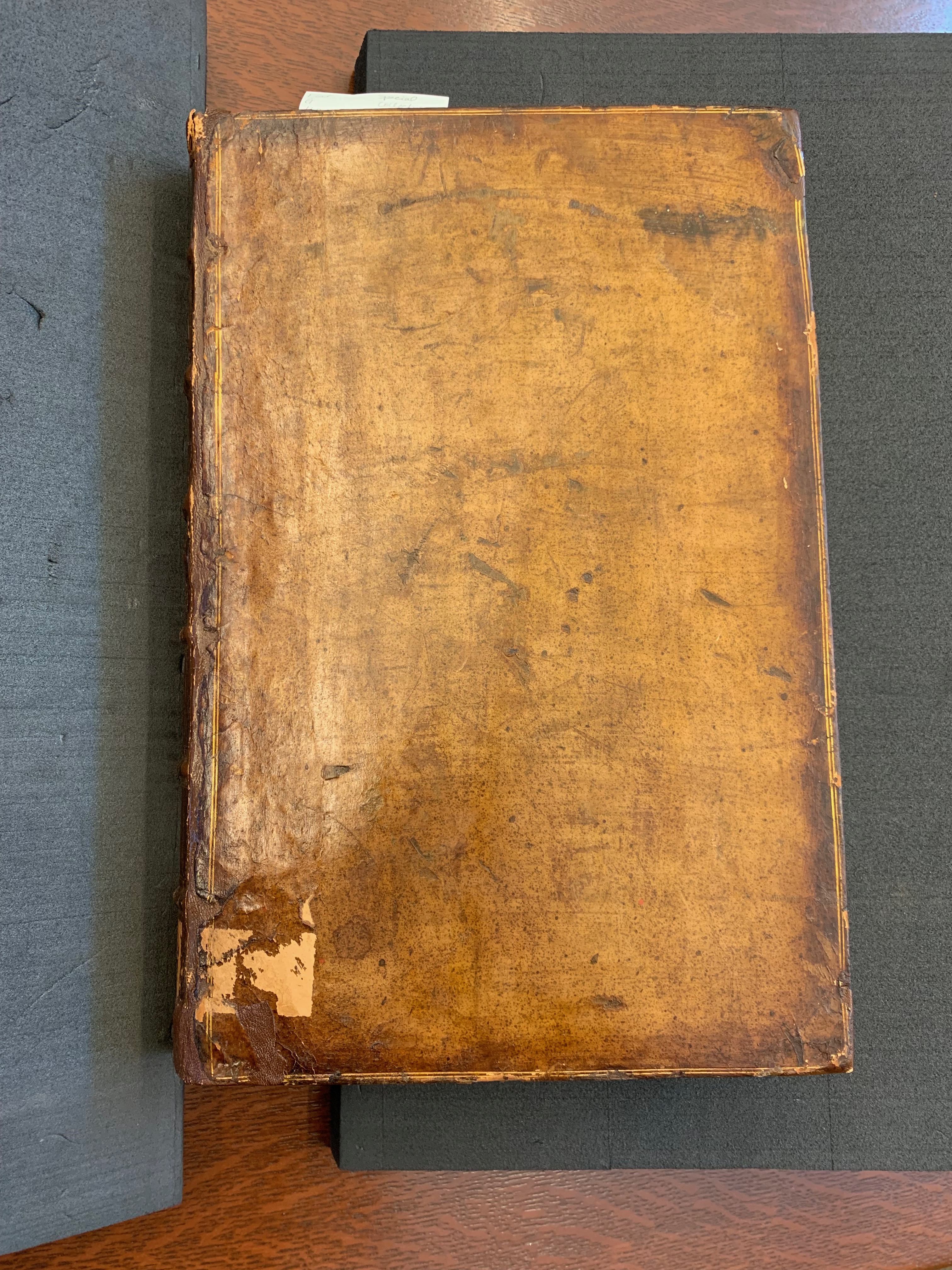
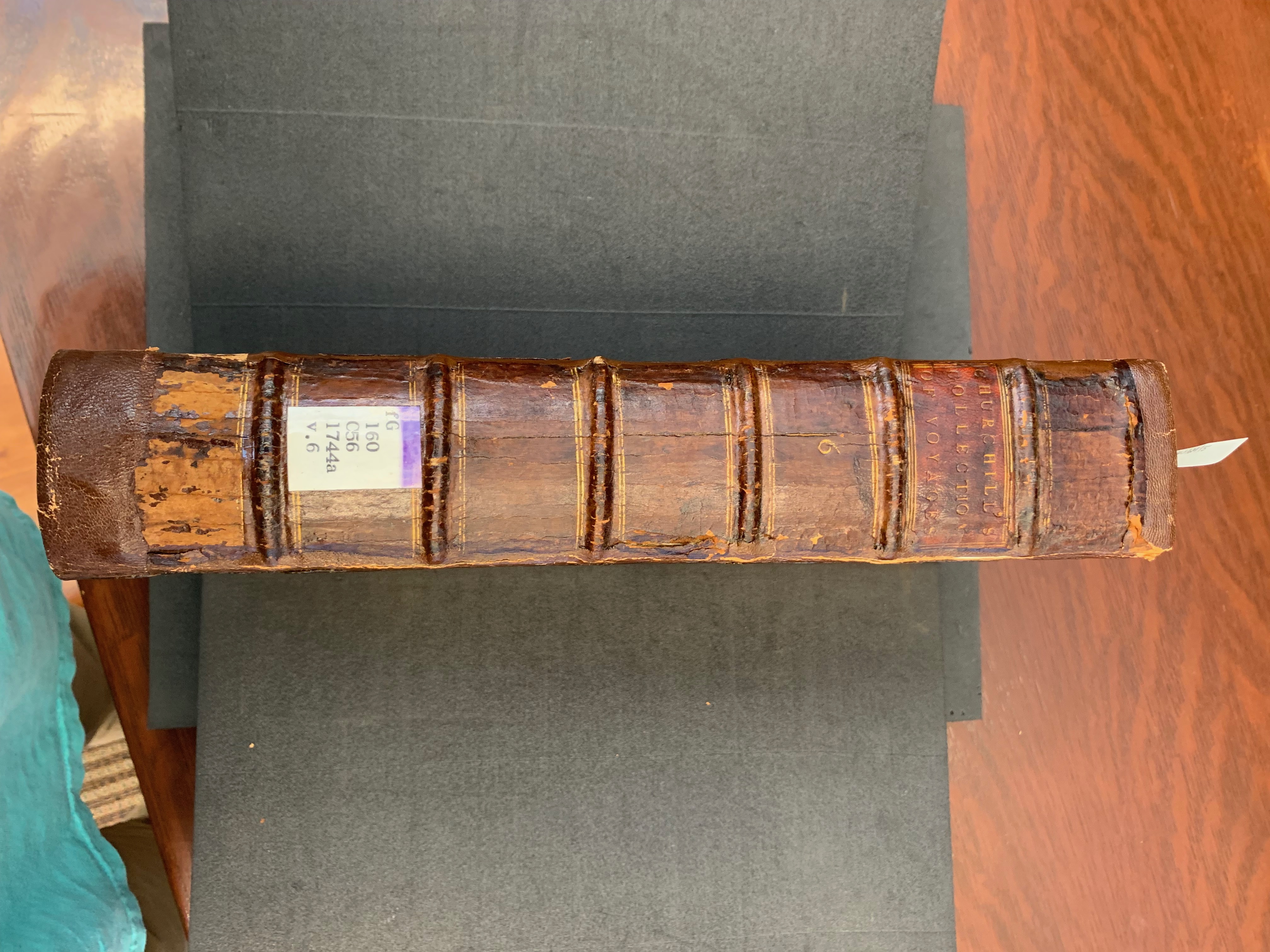
A Collection of Travels and Voyages Volume 6 is a very large book; the dimensions of this book are 36 cm in length, 24 cm in width, 7 cm in height. The cover is made from a leather wrapping over a cardboard base. The leather is mostly hidden under a cover of painted lacquer finish and a shiny appearance. This front has two painted gold stripes running around the edges and is worn and its material is cracked near the corners. These deteriorated areas expose the dark brown leather, and near the binding, revealing its cardboard support. On the binding, "Churchill's Colleciton of Voyages" and "6" are written in gold lettering behind a black background in between the cord bindings. This edition also features a green ribbon bookmark extended out of the binding. There are 824 numerically marked pages, giving this book considerable weight.
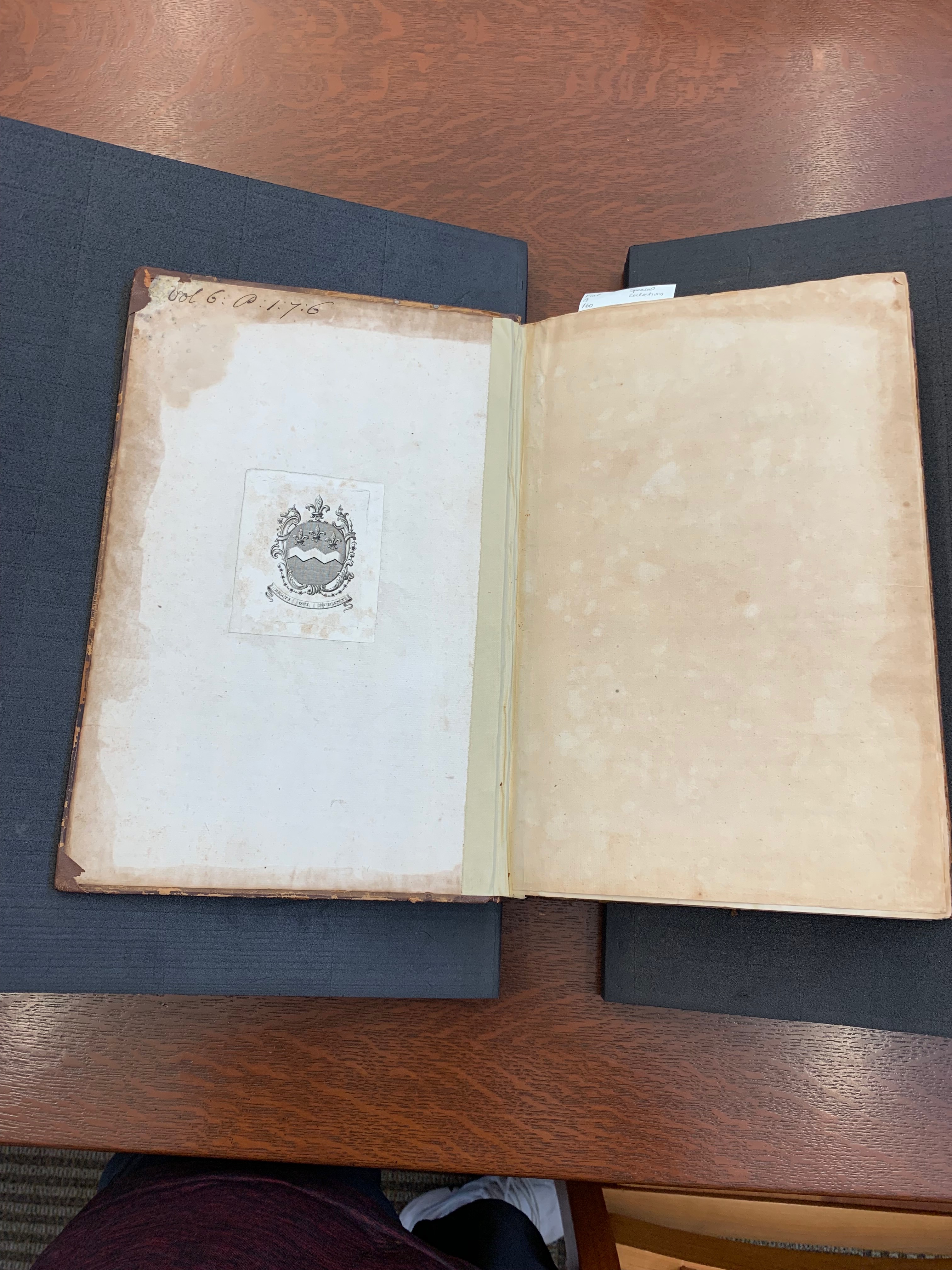
The inside cover features a small black stamp illustration of the Durant family crest which contains four fleur de lis and the lettering “Beati qui Durant”. In the top left hand corner, there’s cursive handwriting using a pen labeled “vol 6: 0:1:7:6”. After the blank first page, the title page follows using black ink and various sizes and typographical emphasis. The full title is listed in detail with a pink and a purple stamp showing record of ownership to and to Santa Clara College California (from 1851) and to Varsi Library University of Santa Clara (from 1931). The following page features a table of contents of chapters I through XII. There is unknown recordship between its publication date of 1746 and its arrival at Santa Clara College. There are also no marginal annotations in this text; the book seems to have had few owners without any non library markings.
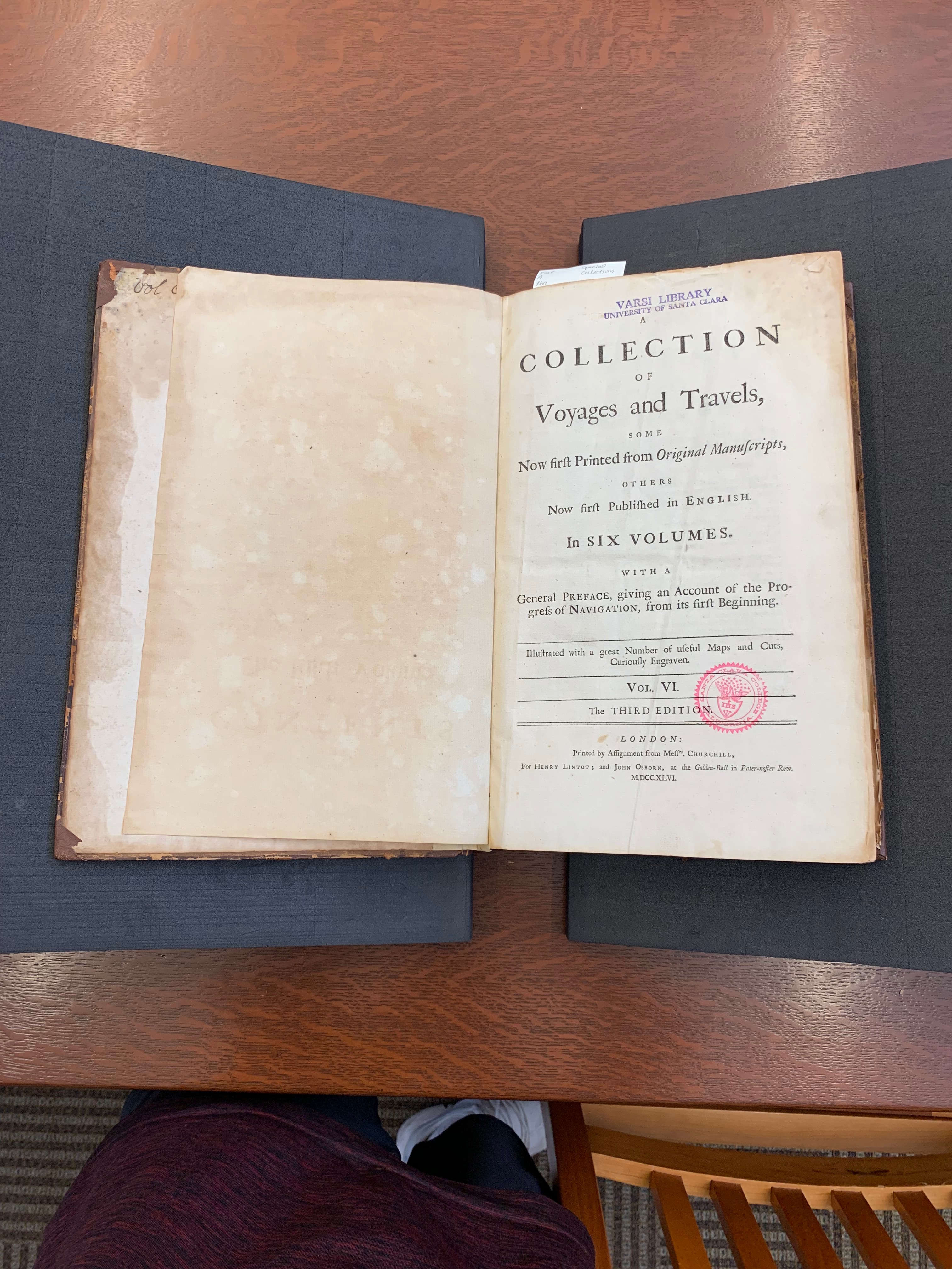
The text on the title page is a serif lettering in an abundance of sizes and uses varied capitalization and italics for emphasis, a theme continuing throughout the entire print. Capitalization shows up in titles to make certain words stand out and draw the reader in. In italics, people, places, and times are emphasized in the text and communicates importance to the reader. There is constant use of a medial S, an old fashioned s shaped like an f used in the middle of words.

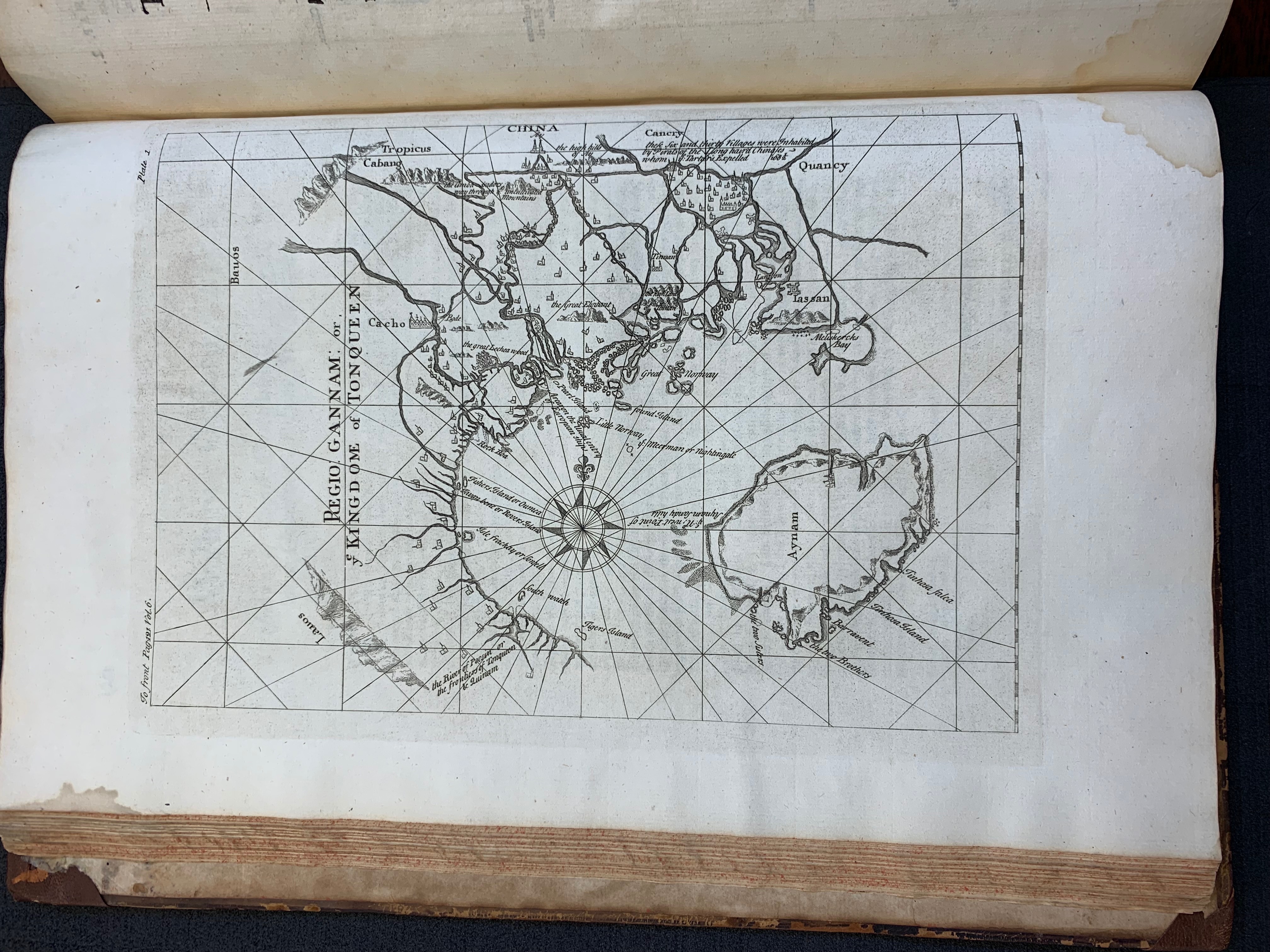
The text contains few illustrations and maps, despite the promise at the bottom of the title page. I have chosen to feature the illustrations of the crest on the cover page, the Metropolis of Tonqueen, the Harbour of Praya, a table of voyage coordinates, the Harbour of Hope, as well as a map of Tonqueen and a the North-West passage.